Ripa Coffee

(About)
Client:
Ripa Coffee
Role:
Branding


(Process)
(01)
Research & Strategy
Before any sketch, we studied the streets. Understanding Barcelona's café culture, the rhythm of its people, and the values behind a fast, intentional coffee experience shaped every creative decision that followed.

(01)
Research & Strategy
Before any sketch, we studied the streets. Understanding Barcelona's café culture, the rhythm of its people, and the values behind a fast, intentional coffee experience shaped every creative decision that followed.
(01)
Research & Strategy
Before any sketch, we studied the streets. Understanding Barcelona's café culture, the rhythm of its people, and the values behind a fast, intentional coffee experience shaped every creative decision that followed.
(02)
Logo Exploration
With a clear strategic foundation, we moved into visual territory — exploring forms, typographic directions, and isotype concepts that could carry the brand's energy. Movement, confidence, and simplicity guided every iteration.

(02)
Logo Exploration
With a clear strategic foundation, we moved into visual territory — exploring forms, typographic directions, and isotype concepts that could carry the brand's energy. Movement, confidence, and simplicity guided every iteration.
(02)
Logo Exploration
With a clear strategic foundation, we moved into visual territory — exploring forms, typographic directions, and isotype concepts that could carry the brand's energy. Movement, confidence, and simplicity guided every iteration.
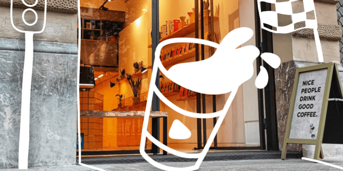
(03)
Brand Direction
From exploration to decision. This is where the tilted cup became the isotype, condensed bold type locked in, and the visual personality of Ripa Coffee took its final shape.
(03)
Brand Direction
From exploration to decision. This is where the tilted cup became the isotype, condensed bold type locked in, and the visual personality of Ripa Coffee took its final shape.
(03)
Brand Direction
From exploration to decision. This is where the tilted cup became the isotype, condensed bold type locked in, and the visual personality of Ripa Coffee took its final shape.
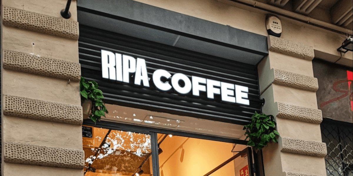
(04)
Visual System
With the identity defined, we built out the full brand system — forest green, black, and electric yellow brought to life across palette, typography, and real-world applications, all documented in brand guidelines ready to use.
(04)
Visual System
With the identity defined, we built out the full brand system — forest green, black, and electric yellow brought to life across palette, typography, and real-world applications, all documented in brand guidelines ready to use.
(04)
Visual System
With the identity defined, we built out the full brand system — forest green, black, and electric yellow brought to life across palette, typography, and real-world applications, all documented in brand guidelines ready to use.